Nue Bedford
Skills:
Brand design, layout design, and social design
Brand design, layout design, and social design
Nue Bedford is a labor of love, a resource devoted to queer artists of color in Minneapolis and beyond. I worked with founder Vanessa to give the new endeavor a visual soul that felt equal parts funky and refined.

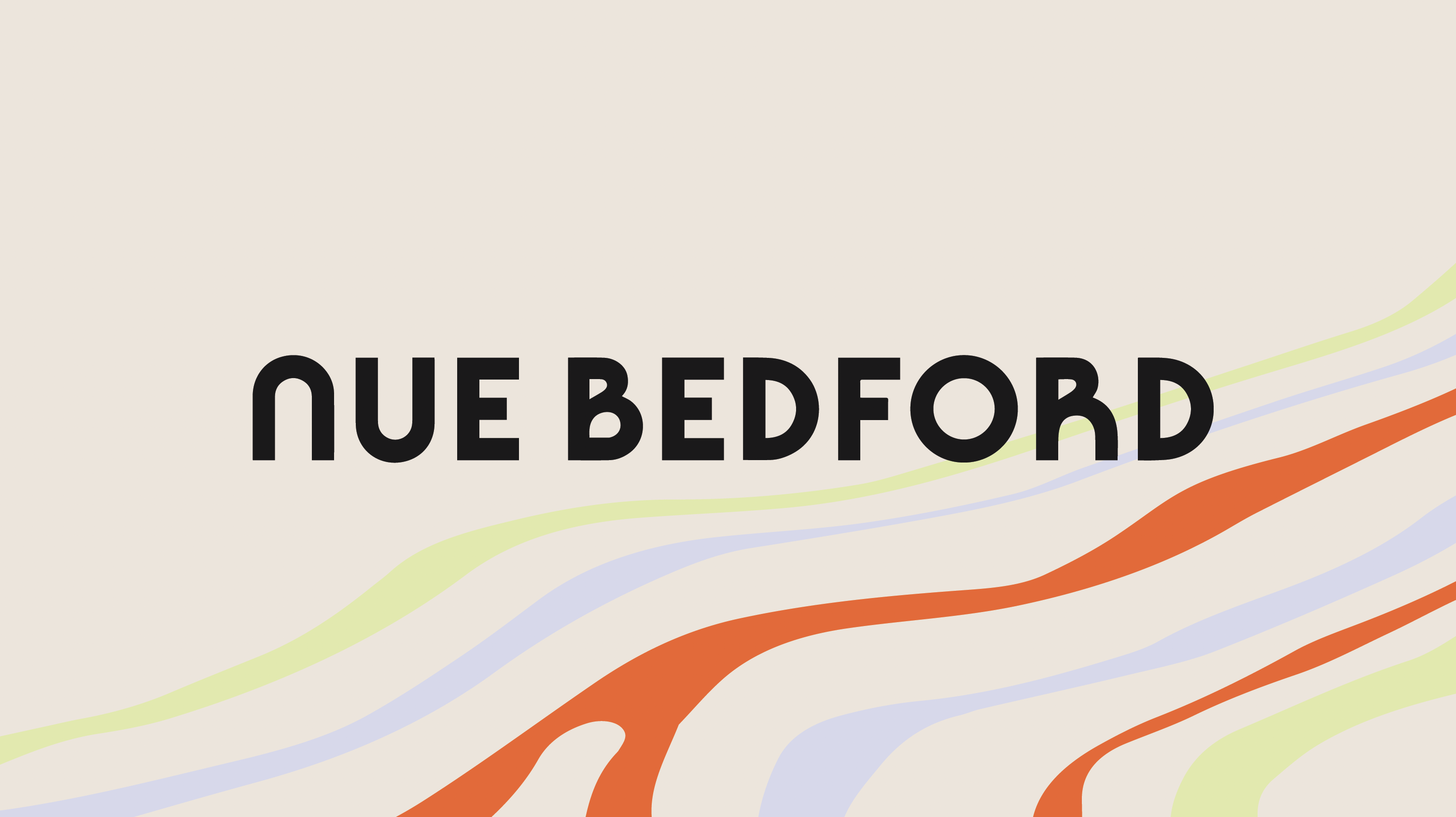
Nue Bedford is a work-in-progress. It’s a place that is evolving based on what its audience needs. It might start as a digital-first platform and be followed by a physical space. So Nue Bedford needed a brand that could feel welcoming, energizing, and special no matter where someone encountered it.

The visual system was built around the idea of an open door or a window, somewhere where queer artists could go and feel 100% themselves. So I created a symbol out of the N and B initials of Nue Bedford, interlocking to create a sparkling window into a more creative place.


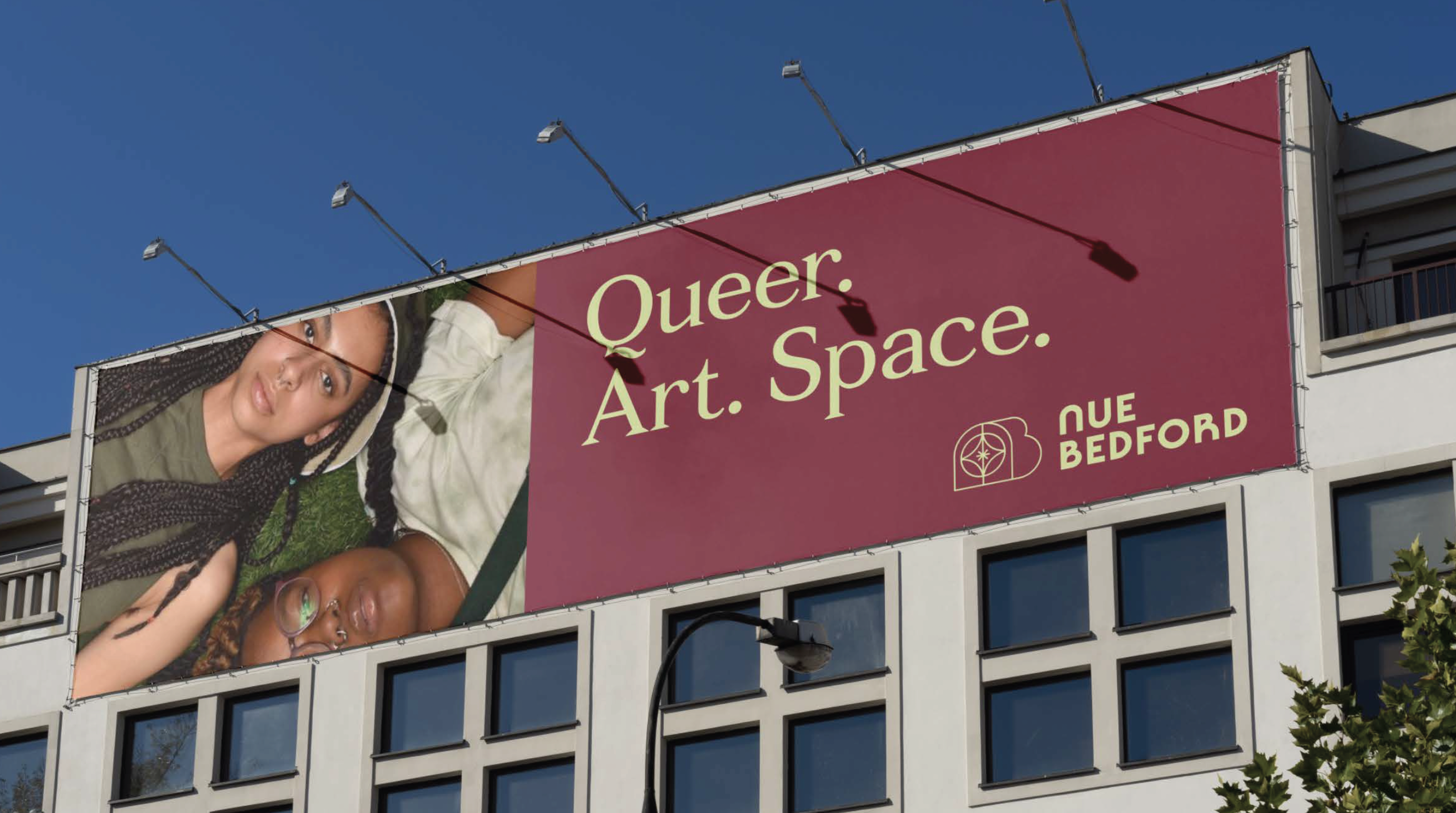
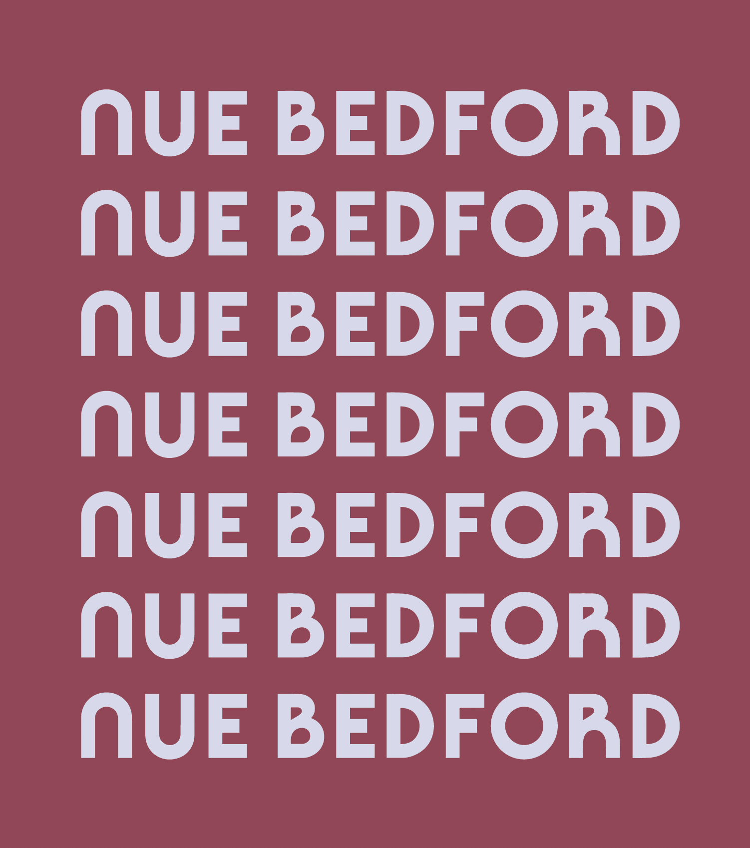
The branding is full of engaging, vibrant color and dynamic flowing patterns. It feels gender neutral without being bland. The typography is editorial-inspired while the lockups balance that by feeling funky, and mimicking the rounded nature of the brand’s main symbol.